
Amica Homepage Carousel
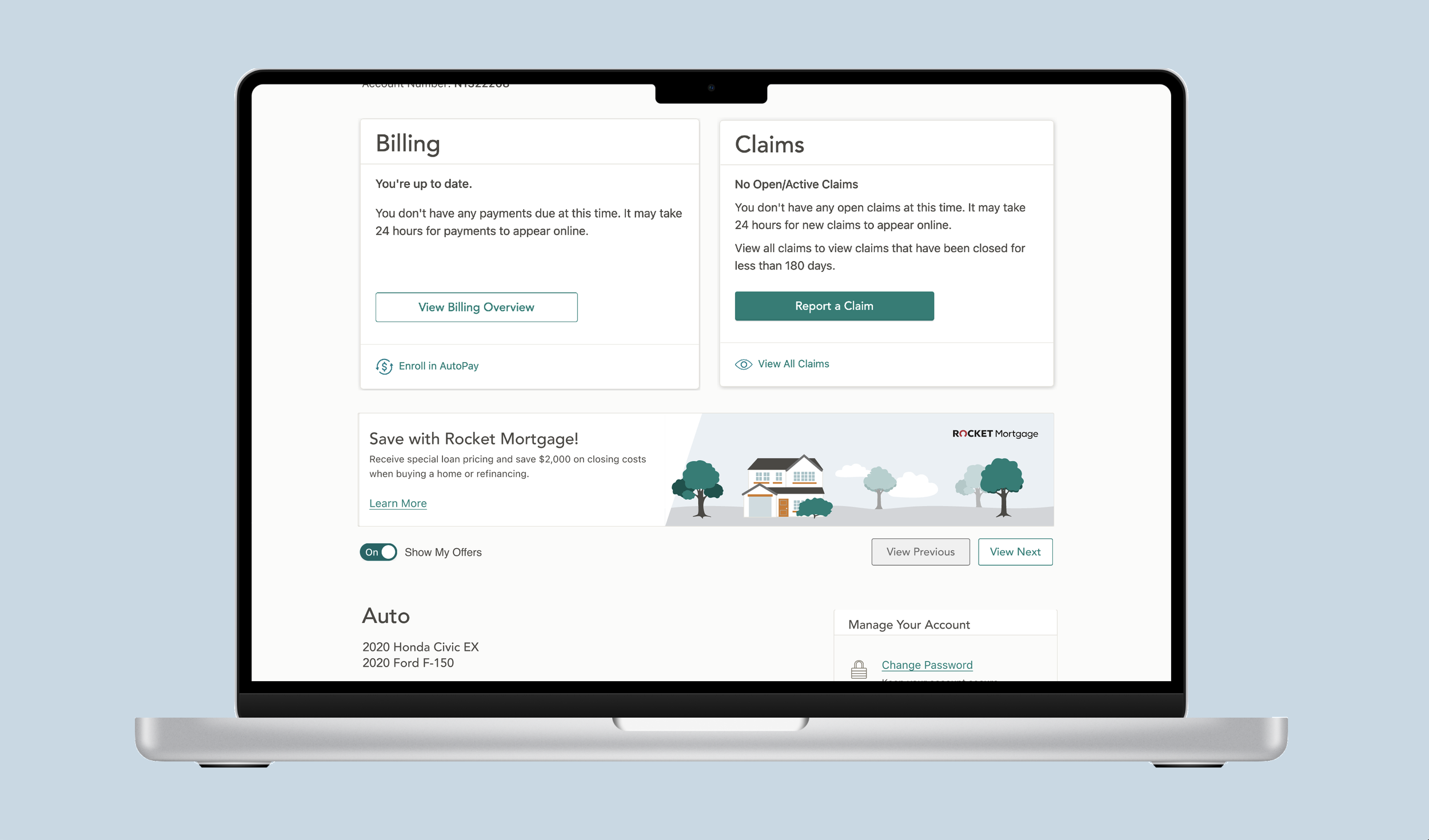
The carousel is visible on the user’s dashboard and can be hidden using a toggle
Project Overview
SUMMER 2022 - Fall 2022
Amica's policy holder's account dashboard was becoming cluttered with banners promoting 'discounts' and 'offers' to the user. To address this issue, we introduced a carousel component with the following objectives:
Alleviate the problem of stacking banners that occupied valuable screen space.
Provide users with the ability to opt out of promotions and hide the banners.
The process included researching accessibility best practices for carousels, conducting A/B testing, and reworking the current banners to be consistent to work in a carousel.
Following the feature's implementation, it garnered recognition in the P&C Monitor Awards, with Amica securing a gold award for excellence on our Policy Holder homepage."
-
I created two potential design directions for the component, oversaw research, created prototypes for testing, and worked with developers throughout handoff.
-
My Design Lead was a huge help when it came guidance on the process and accessibility research (read more below) along with recommending swiping functionality for mobile users.
-
The researcher helped formulate the “task” and conducted A/B testing to determine the design direction (see more below)

The mobile version of the carousel previews the next promo and allows the user to swipe left and right.
Corporate Insights Gold Award
p&C Insurance Monitor awards 2022
Amica's Account Home achieved a Gold award, among 17 other carriers in the category of policy holder homepages. The promotional carousel played a role in this achievement, with CI noting its capability to toggle visibility, easily scan through content, and highlighting the vibrant tiles featured on the page.

Design and Accessibility

Accessiblity
To ensure accessibility, the carousel does not automatically rotate due to potential challenges for individuals with vestibular and cognitive issues.
We also implemented clearly labeled 'previous' and 'next' buttons, designed to be descriptive for screen reader users.
On mobile devices, we adhered to the standard best practices by making the small preview of the next card at least 44 pixels wide to provide an adequately sized click area."
Consistency & Prep work
Several promotions displayed inconsistencies and needed to be redesigned and recoded to ensure uniform height to fit in the carousel.
Additionally, the various font and header sizes on the banners were addressed to establish consistency, aligning with the new design's requirements.
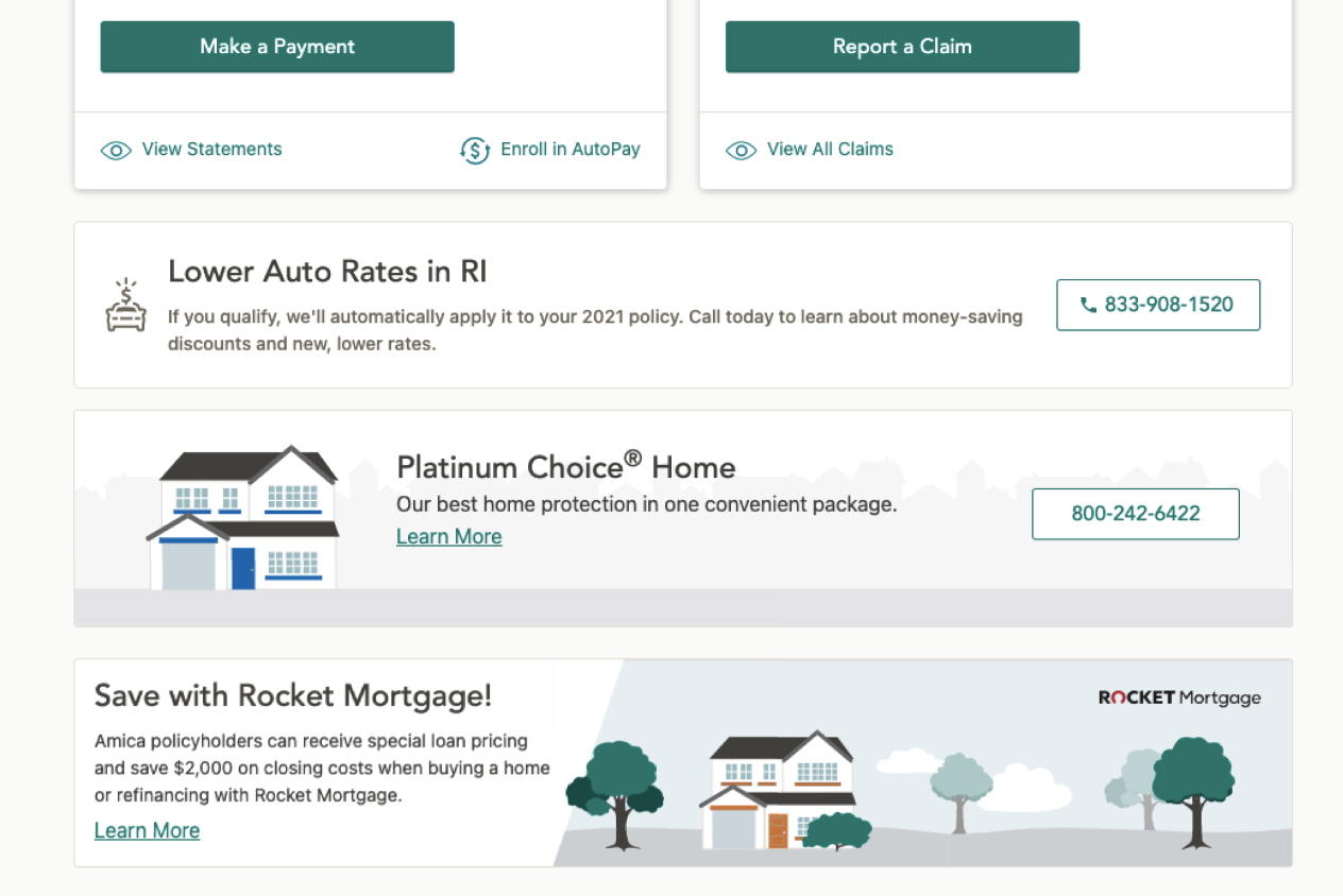
Before implementing the carousel, banners were starting to stack on the user’s homepage.
UX Research
results
68% of users favored the 'hide all' option over an individual opt-out.
We instructed users to locate a discount percentage without referring to the carousel. In the 'hide all' version, there was only a 10% failure rate, while the other design exhibited a 45% failure rate.
Furthermore, users were more inclined to use the carousel to explore discounts in the 'hide all' version."
A/B Testing Overview
We conducted A/B tests on two ways to 'opt-out' of promotions. The first option allowed users to hide individual banners, while the second provided a 'hide all' feature to conceal the entire carousel.
Both approaches featured slightly different styling and designs, aiming to determine which one resonated more with users.
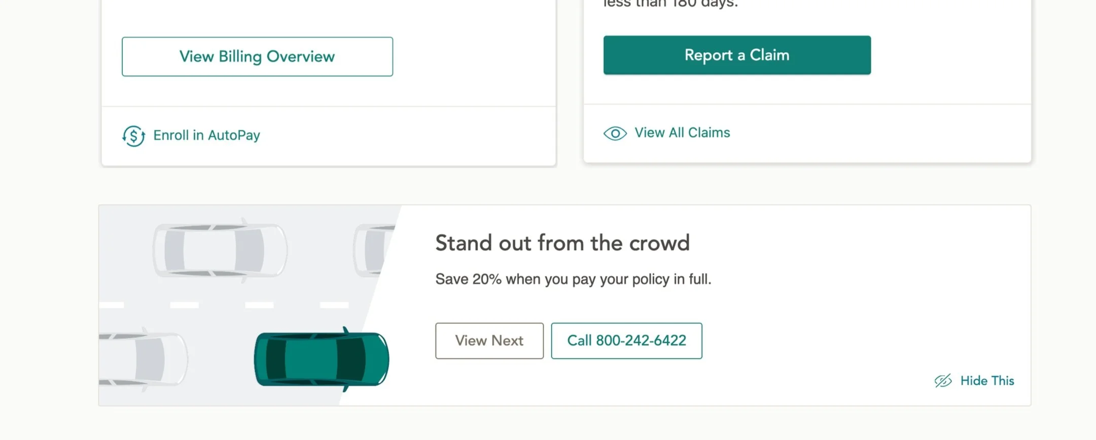
The alternative design allowed the user to click the “hide this” link to hide certain promotions, but not all promotions.

Each banner needed to be reworked for multiple breakpoints
Carousel Results
Overall the carousel is a helpful tool for users. One promotion, for example, generates over 1000+ clicks a month based off helping users understand how to enroll in paperless and get a discount.
User feedback:
“Love the website; it's user friendly and modern. I especially love the "show my offers" toggle so that I could hide the paperless enrollment suggestion after I already enrolled"
Future recommendations
Unprompted during testing, users expected to see 'dots' to indicate the number of promotions and their current position within the carousel. This was noted as a potential enhancement for a future iteration.